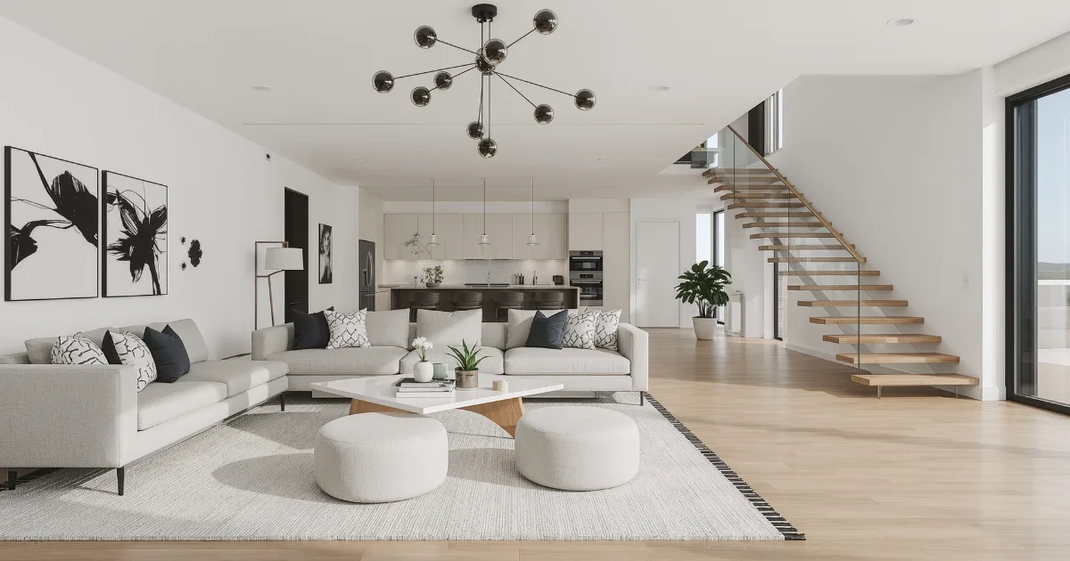
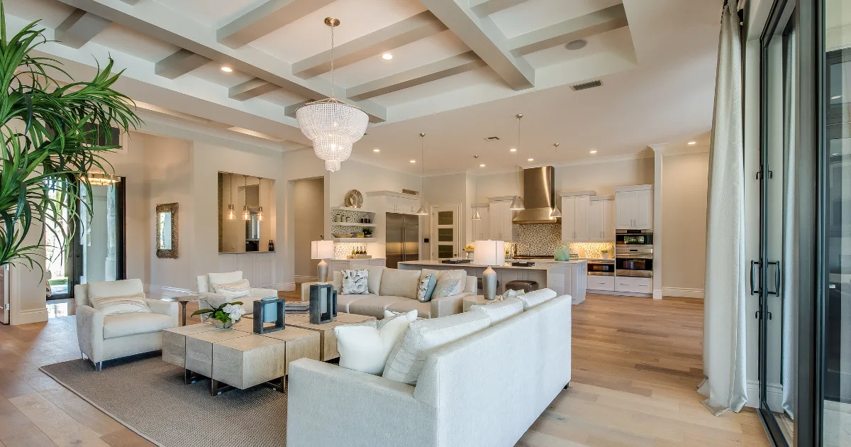
In a house with walls, a color only has to work in one room. In an open plan it has to work in a space that is bright at one end and dim at the other, serves three purposes at once, and gives the color almost nowhere to stop.
That is the real problem with choosing a paint color for an open concept space, and it is a different problem from choosing a color for a room.
Why an open plan changes the decision
A conventional floor plan hands you two things for free. Every room gets its own color decision, judged on its own, and every color change has a doorway or a corner to end at.
An open plan removes both. The kitchen, dining area, and living area are one continuous surface with one continuous run of trim. They may face three different directions, take light through windows of different sizes, and be lit at night by pendants over an island and lamps thirty feet away. One color has to hold up across all of it.
So the question is less about which color and more about how far it runs, where it ends, and whether it survives the trip from the brightest corner to the darkest one.
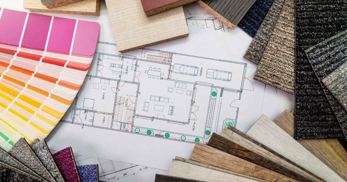
Paint color for an open concept space: six rules
1. Find the stopping points before you choose the color
Color changes need an edge. In an open plan there are fewer of them, and the ones that exist are easy to miss until paint is already on the wall.
Walk the space and mark where a color could credibly end. These are the usual candidates:
| Stopping point | Why it works |
|---|---|
| An inside corner | A clean vertical line from floor to ceiling, cut by hand |
| A cased opening or doorway | The casing itself ends the color |
| A change in ceiling height or a dropped soffit | The break is already architectural |
| A structural column, post, or partial wall | The eye reads it as a boundary |
| The back of a built-in or a run of cabinetry | The color change hides behind the millwork |
| A beam or header spanning the room | The ceiling plane gives the wall a reason to stop |
If the space has none of these between two areas you wanted to treat differently, that is the answer: those two areas take the same color. A color change that stops in the middle of an uninterrupted wall reads as an unfinished job rather than a decision, and no amount of taping fixes it.
This is also why the original advice to start with a light neutral is sound rather than timid. A single unobtrusive field across the connected areas lets furniture, cabinetry, art, and rugs define the zones, which is what people actually read as separation.
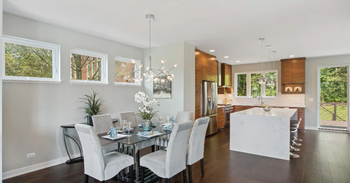
2. Choose for the dimmest light in the space, not the brightest
An open plan usually spans more than one exposure, and a color behaves differently in each one.
Sherwin-Williams frames it by orientation. North-facing areas get the least light through the day and the coolest light, so warm neutrals and higher light reflectance values hold up best there. South-facing areas take consistent warm light and accept nearly any color, though very warm colors can read as bold at some hours. East- and west-facing areas flip through the day, warm in the morning and cool in the evening for east, the reverse for west, so the color gets chosen around the hours the space is actually used.
In a space with three exposures, those directions are not alternatives. They are all happening at once in one color field. The usable rule is to choose for the weakest corner. A color that still looks right in the dim end will look right everywhere else; a color chosen in the sunny end will go gray and flat at the other.
Light reflectance value is the number worth asking for. It runs from 0 to 100 and describes how much light a color sends back into the room. Higher values suit the areas starved of daylight.
Artificial light deserves the same check. Sherwin-Williams notes that warm bulbs intensify warm colors and dull cool ones, while cooler light does the reverse, and that light from ceiling fixtures falling straight down can make the tops of walls read darker than the rest. An open plan is usually lit by several fixture types at once, so look at the samples after dark as well.
3. Let the trim and the ceiling do the connecting
In an open plan the trim is not a detail. It is the one element that runs the entire space without interruption, which makes it the strongest unifier available.
Benjamin Moore's approach to a whole-house palette puts a single trim color at the center of it, with off-white as the usual choice because it works against the widest range of wall colors, warm whites reading traditional and cool whites reading modern. One trim color through the connected space lets everything else vary without the space coming apart. If you are considering something other than white, we have covered that separately in what color should I paint my interior trim.
The ceiling works the same way and is easier to overlook. In an open plan it is one unbroken plane over every zone, so a single ceiling color is doing more connective work than it would in any single room.
4. Keep one sheen across the field
Sheen changes how a color reads. Higher gloss reflects more light, enriches and brightens the color, and shifts its appearance depending on the angle you stand at. Flatter finishes absorb light and hold the color steadier.
In a closed room that variation is invisible, because you never see two sheens on the same plane. In an open plan you often do. The same wall color at two sheens, meeting at a corner you can see both sides of, reads as two colors. Keep one sheen across the connected wall surfaces, and let the trim carry its own higher sheen as usual.
Use the same product line across the whole field as well. Sheen consistency comes from the product and the application, so switching lines partway through can show in angled light even when the color is matched exactly.
5. Zone with contrast, and make only one move
A neutral field does not mean a colorless space. It means the color moves are deliberate and few.
Benjamin Moore suggests a working ratio of roughly 60 percent dominant color, 30 percent secondary, and 10 percent accent, with secondary colors chosen to share an undertone with the dominant one rather than to contrast with it. In practice, in an open plan, that usually comes down to one real move: a deeper color on a single wall that already has a job.
The wall behind a fireplace. The wall carrying built-ins. The back of an island or the run of cabinetry that marks where the kitchen ends. One of those, treated once, zones the space. Two or three of them competing turns the room into a set of unrelated panels, which is the thing open plans are least able to absorb. The same caution applies to bold color generally, which we have written about in interior painting ideas.
A monochromatic approach is the quieter version of the same idea and works well here. Take one color and vary its depth across the zones rather than changing hue. The relationship is guaranteed because the colors are relatives, and the variation gives the eye the separation an open plan otherwise lacks.
6. Sample on the real walls, at both ends, twice a day
Every manufacturer says to sample. In an open plan the instruction has a specific form.
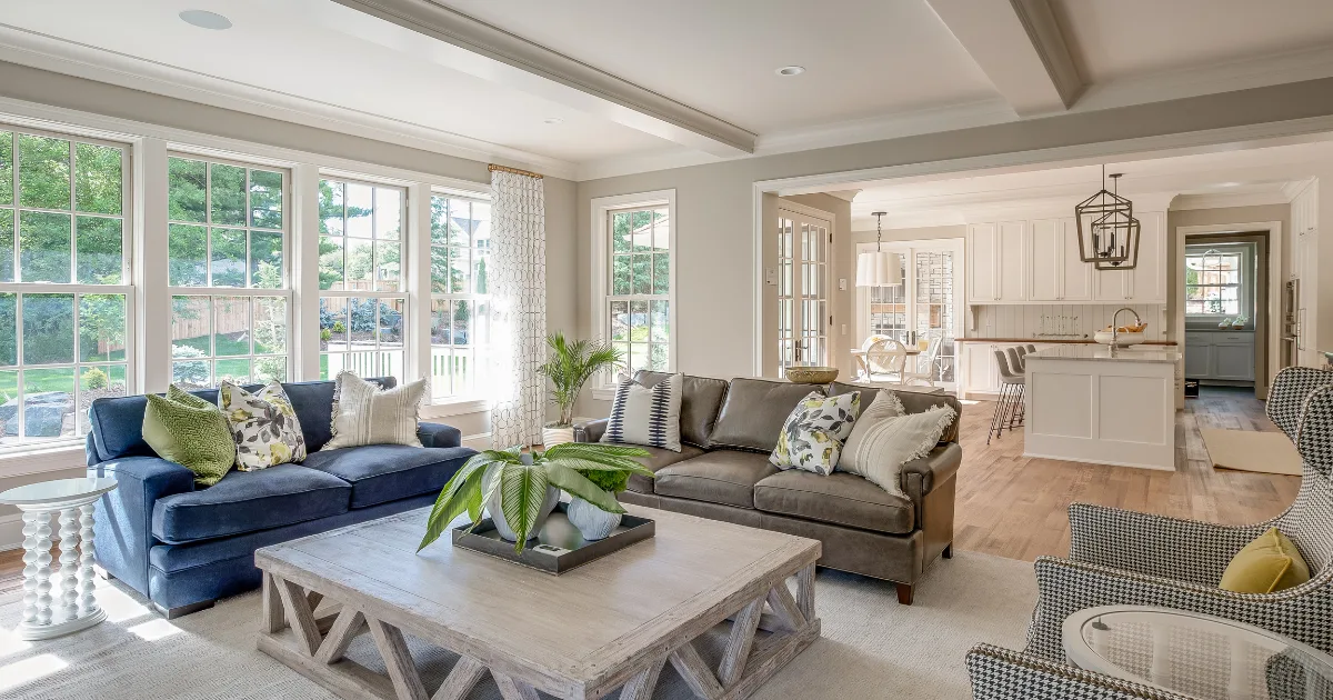
Put large samples directly on the walls you intend to paint, not on a board carried around the room. Put one in the brightest area and one in the dimmest, because the same color in one space is the whole point of the exercise. Look at both in daylight and again under the lights you use at night. Then stand where you will actually be: at the island, at the table, on the sofa. Sight lines in an open plan are long, and a color is judged from across the room far more often than from arm's length.
What usually goes wrong
- A color change with nowhere to land. The change dies mid-wall, or at an opening with no casing, and reads as a mistake.
- Too many colors in one sight line. Three zones, three colors, all visible at once, and nothing to tie them together.
- A color chosen in the sunniest corner. It looks right at the window and dead at the far end.
- Sheen or product changed partway through. The color matches and the wall still looks like two walls.
- Trim treated room by room. The one element that could have unified the space instead breaks it up.
- Samples judged on a chip. A small card next to a window is not the same as a large sample on the wall it is going on.
How the color plan gets settled on your project
A field supervisor meets you in the space before anything is scheduled. You look at the sight lines together, find the stopping points, and decide which areas take the same color and which earn a change. The exposures and the light at different hours are part of that conversation, because they decide the color as much as preference does.
Colors are selected before the first day on site. On an interior painting project in Westchester, Rockland, Putnam, Dutchess, or Bronx County, or in Fairfield County, Connecticut, the proposal states the colors, the sheens, and where each one stops, so the plan is settled in writing rather than resolved on a ladder. Residential painting is backed by our 5-year warranty on workmanship.
Where a color change lands on an inside corner, the line is cut by hand. In an open plan that corner is usually visible from most of the room, which is why it gets the attention it does.
Frequently asked questions
Should an open concept space be all one color?
Often, yes. If there is no inside corner, cased opening, soffit, or column where a color could credibly stop, the connected areas take the same color and the zones get defined by furniture, cabinetry, and lighting instead.
How many colors can an open floor plan take?
In most homes, one field color, one trim color, one ceiling color, and at most one accent. More than that in a single sight line tends to read as disorder rather than variety.
Can the kitchen be a different color from the living area?
Yes, when there is something to end the color on, such as a cased opening, a soffit, a column, or the back of the cabinetry. Without an edge, the change is better carried by the cabinets than by the walls.
Why does the same color look different at each end of the room?
Because the two ends get different light. Orientation, window size, and the bulbs in the fixtures all change how a color reads, which is why samples go up at both ends and get looked at twice a day.
Does the ceiling have to be the same color throughout?
In an open plan the ceiling is one continuous plane, so a single color across it is the usual choice. A change in ceiling height or a dropped soffit is the exception that gives a second color somewhere to start and stop.
Schedule a consultation
The fastest way to settle an open plan is to stand in it with someone who paints them. Schedule a consultation and a field supervisor will walk the sight lines with you and put the colors, the sheens, and the stopping points in writing.