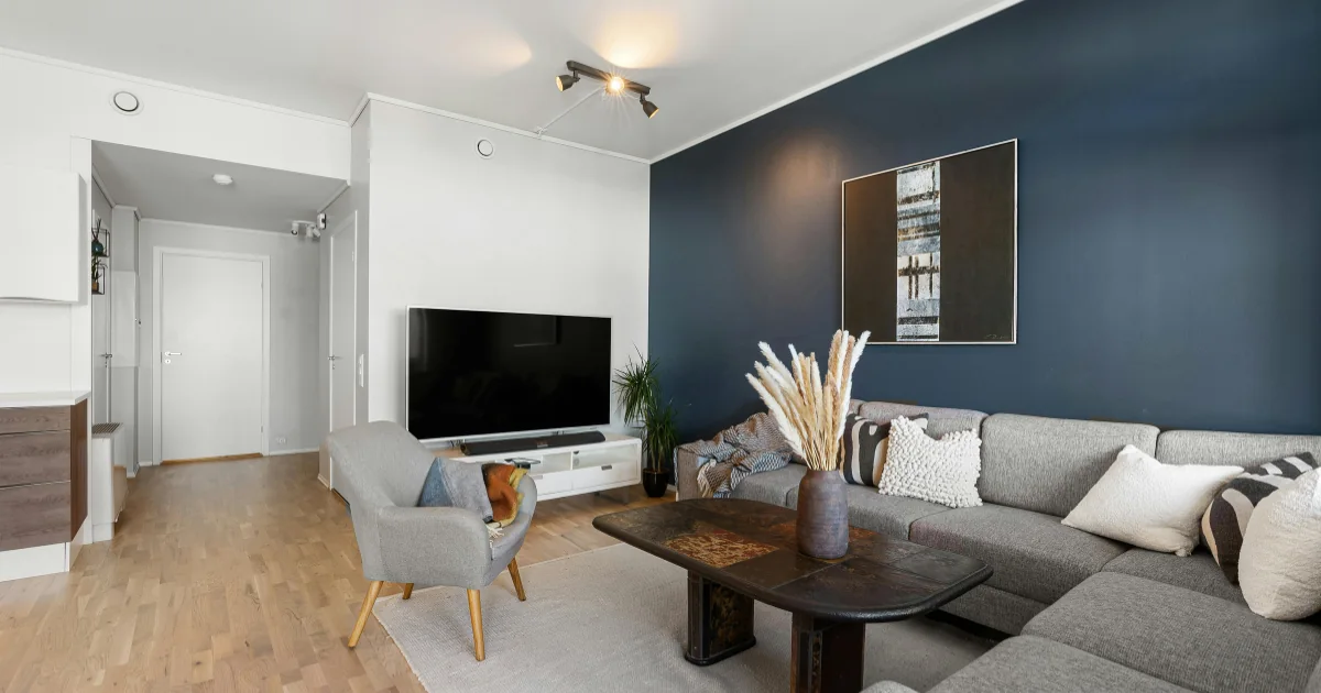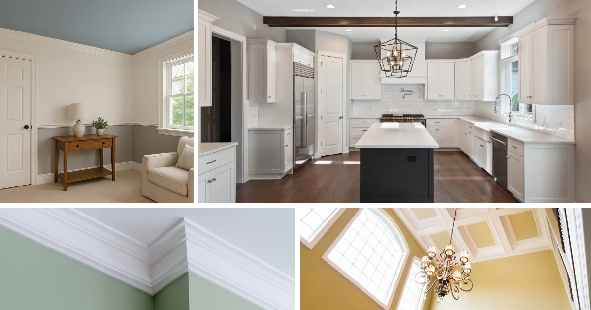
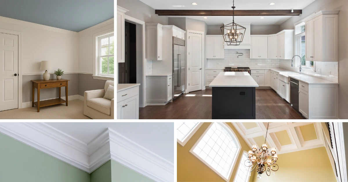
Choosing colors for your home is one of the most exciting parts of redecorating, but it can also feel overwhelming. With so many paint colors available, homeowners often ask the same question: Where do I start when choosing colors for my home?
The good news is that there is a simple and proven approach that can make the process much easier. When planning interior repainting, professional painters and designers typically recommend starting with the areas that connect the home together. This method creates a smooth, unified look and makes future color decisions far less stressful.
Why Choosing Colors for Your Home Can Feel Difficult

Many homeowners begin by focusing on individual rooms. A living room color here, a bedroom color there. While this seems logical, it can create an unintended result. When each room is treated as a separate project, the transition from one space to the next may feel abrupt or disconnected.
Choosing colors for your home works best when there is a clear starting point and a sense of flow. Homes are not viewed one room at a time. They are experienced as a whole. Establishing a foundation color palette first helps ensure the finished result feels intentional and well planned.
Start With Connecting Spaces First
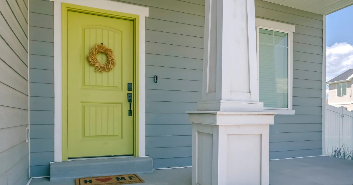
When choosing colors for your home, the smartest place to begin is in the open, connecting areas. These spaces usually include:
- Entryways
- Hallways
- Stairwells
- Open foyers
These areas naturally lead from one room to another, making them the ideal place to establish your main color direction. Once these connecting spaces are painted, they serve as a backdrop that ties the rest of the home together.
By starting here, you allow individual rooms to express their own personality while still feeling connected to the overall design.
Why Neutral Colors Work Best as a Foundation
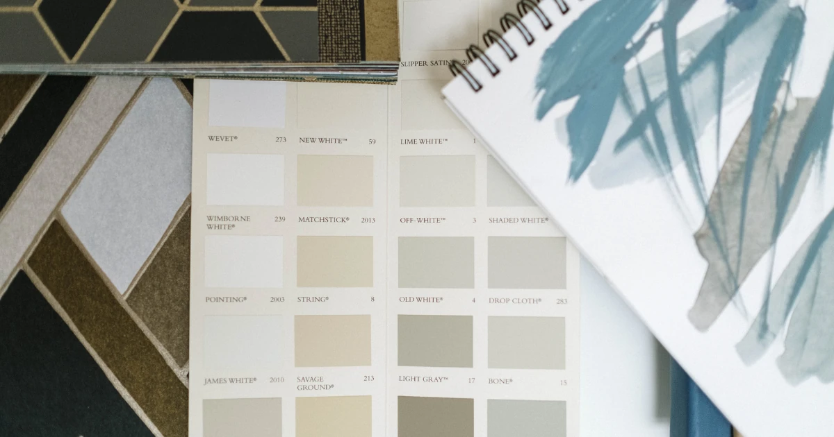
Professional house painters often recommend starting with a light, neutral color for these connecting spaces. Neutral colors provide flexibility and balance, making it easier to coordinate surrounding rooms.
The word neutral sometimes sounds boring, but it does not have to be. There are hundreds of attractive neutral paint options available, including:
- Warm and cool whites
- Off whites and soft creams
- Beiges and taupes
- Greiges
- Light and mid tone grays
Many of these colors include undertones of brown, yellow, or green, which add depth and warmth without overpowering the space.
Choosing a neutral foundation gives you the freedom to be more creative in individual rooms later on.
Using Trim to Add Visual Interest
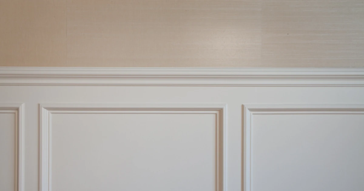
White trim remains a classic choice when choosing colors for your home, especially in neutral palettes. Clean white trim helps define architectural features and provides contrast against softer wall colors.
If you are concerned about a neutral palette feeling too plain, decorative elements can easily add interest. Furniture, artwork, rugs, and accessories all play an important role in bringing warmth and personality to a space without requiring bold wall colors throughout the home.
Expanding Your Color Choices Room by Room
Once the main color palette is established in the connecting spaces, choosing colors for individual rooms becomes much easier. At this point, you can begin to express your personal style throughout the home.
Inspiration for room colors can come from many places, such as:
- Area rugs or carpeting
- Upholstered furniture
- Artwork or photographs
- A favorite season
- A meaningful memory or travel experience
Bedrooms, dining rooms, offices, and family rooms can all feature richer or more expressive colors while still feeling cohesive with the rest of the house.
Creating Harmony Without Matching Everything
Choosing colors for your home does not mean every room must look the same. Harmony comes from coordination, not repetition. A well designed home allows each space to feel unique while still belonging to the same overall design story.
By keeping undertones consistent and using the connecting spaces as your anchor, you avoid the common mistake of clashing colors and mismatched transitions.
Professional Help Makes Color Selection Easier
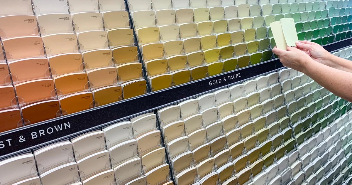
Even with a plan in place, choosing colors for your home can still feel challenging. Lighting, room size, and existing finishes all influence how paint colors appear once they are on the wall.
A.G. Williams Painting Company offers professional color consultations to help homeowners select the right look, feel, and mood for every area of their home. Our experienced team works closely with clients to ensure paint colors complement both the architecture of the house and the way each space is used.
A.G. Williams Painting Company proudly provides residential painting services throughout Westchester County and Fairfield County, including White Plains, Scarsdale, Bronxville, Greenwich, Armonk, and Chappaqua. Contact us with any questions.